7 Email Design Inspiration Trends for 2024
What Is Email Design
Email design is the process of creating visually appealing and effective email campaigns. It involves crafting engaging subject lines, designing layouts that are easy to read on various devices, and incorporating images, videos, and other multimedia elements.
In addition, email design must consider the limitations of email clients and web-based email providers, such as image blocking and automatic virus scanning. As a result, email designers must have a thorough understanding of both graphic design and coding.
With this knowledge, they can create beautiful and functional emails that reach their intended audiences.
Why Does Email Design Matter?
In the modern business world, an email is an essential tool for communication. Whether you're sending a message to a client or colleague or need to share important information with a team, email is often the best way to get the job done.
However, with so many messages being sent daily, it can be difficult to stand out from the crowd. That's where email design comes in.
With the help of email design software, you can ensure that your messages are always seen and read by your intended audience by taking the time to design professional and eye-catching emails. In addition, well-designed emails can help to build trust and credibility with customers and clients.
In today's fast-paced world, first impressions are everything. So if you want to ensure that your business is always making a good impression, it's important to invest in email design.
Why Email Marketing Matters in 2024
Email marketing continues to be a powerful tool for reaching and engaging customers. In 2024, businesses will need to focus on quality over quantity regarding their email lists.
Having a smaller list of engaged subscribers is more important than a large list of unengaged users. Email marketing provides an opportunity to nurture relationships with customers and build loyalty.
It's also a great way to stay top of mind with your audience and drive traffic back to your website or online store. In the age of social media, email marketing provides a direct line of communication that can be personalized and highly effective.
For these reasons, email marketing will continue to be an essential part of any digital marketing strategy in 2024.
Your Guide to Email Design
Email design can be daunting, especially when trying to keep up with the latest trends. However, this guide provides a comprehensive overview of email design trends for the next year.
In addition to highlighting current trends, the guide offers practical advice on implementing them in your email designs. As a result, you'll be able to create stylish and effective emails to engage your audience.
Whether you're a seasoned email designer or just getting started, this guide is an essential resource for staying up-to-date on the latest Email Design Trends.
1. Color Usage
In Email Design, it's important to use colors strategically to catch the reader's attention and convey the desired message or mood.
One tip is to stick with a limited color palette, typically no more than three main colors plus white and black. In terms of trends, experts predict that pastel shades will continue to be popular in 2024 and bold, vibrant colors that create a sense of energy.
Additionally, using shades of a single color in various tints and tones can create a cohesive and sophisticated look. Overall, using color in Email Design should enhance the overall aesthetic and effectively convey the message to the reader.
It's also important to consider color accessibility in Email Design, as some colors may not be easily distinguishable for individuals with visual impairments. Utilizing color pairing and enough contrast can help ensure that the Email Design is accessible for all audiences.
In summary, carefully selecting and utilizing color in Email Design can significantly impact the message's overall effectiveness.
The Do's
- Do use the colors of your brand
- Do consider color accessibility
- Do stick with a limited color palette
- Do use shades of a single color for cohesion
The Do Not's
- Don't overwhelm the design with too many colors
- Don't use colors that may clash or distract from the message
- Don't overlook the impact of color on the overall Email Design.
- Don't forget to consider the cultural significance of colors in different regions and demographics.
2. Font Usage
In Email Design, it is important to use fonts that are easily readable on both desktop and mobile devices.
In 2024, Sans Serif fonts will likely continue to be popular for their simplicity and versatility. Similarly, allowing for user-defined font settings will become even more important as personalized inbox experiences increase in popularity.
For a bold statement or added personality, designers may incorporate modern, geometric serif fonts or playful display fonts as accents.
Ultimately, the goal is to create a visually appealing and accessible design for all readers.
The font size should be large enough to be easily read but not so big that it takes up too much space in the design. Additionally, it is best practice to use a maximum of two or three different fonts in Email Design for visual consistency and cohesiveness.
Fonts you must avoid.
It is important to avoid using non-web safe fonts, as they may not display properly for all readers. The safest options are basic system fonts such as Arial and Times New Roman.
It is also important to steer clear of overly decorative or hard-to-read fonts in Email Design for readability purposes. Finally, using a branded font should only be done if it is available for all readers and does not distract from the overall message of the Email.
3. Image Usage
When designing emails, it is important to remember what your reader will be seeing. The image should match up with the text and give them enough information so that they can understand its contents before reading any further.
You can use graphics to spice up your email. Make sure the picture is small enough so it doesn't take forever for you read this message, and try not have more than one large file size on hand at any given time because these things may cause loading issues!
In Email Design, using pictures can enhance the overall aesthetic and convey information in a visually appealing way. It is important to consider image size and file type to ensure that the email loads quickly for the recipient.
In 2024, we may see an increase in personalized and relatable images and bold and colorful graphics. The use of animated GIFs may also continue to be popular in Email Design. When incorporating pictures into Email Design, it is important to keep user preferences and accessibility.
Video from Designmodo GIF usage in Email
Considerations in mind. Using pictures strategically can enhance an email's overall message and aesthetic.
Additionally, it is important to remember to always obtain proper permissions and credits for any images used in Email Design.
4. Template Usage
As technology continues to advance, email design trends also evolve and change. One trend that is expected to continue into 2024 is the use of templates in email design.
Templates save time and provide consistency for brands and offer mobile optimization and can be easily customized with branding elements.
In 2024, we can expect to see more interactive and personalized email templates and a focus on minimalism and simplicity. Additionally, the use of animation and motion in email templates will likely become more popular.
Overall, utilizing templates in email design is a practical solution that allows for creativity and flexibility.
It's important to stay up-to-date on current email design trends to create successful and visually appealing campaigns. Keeping an eye on these trends and utilizing templates can help brands effectively connect with their audience and achieve their goals.
The following are some of the most well-received marketing email designs.
Triangle layout: This layout features a bold triangle at the top of the email, with the main message and call-to-action placed within it. This design helps draw attention to those key elements and can give a more modern look to your email.
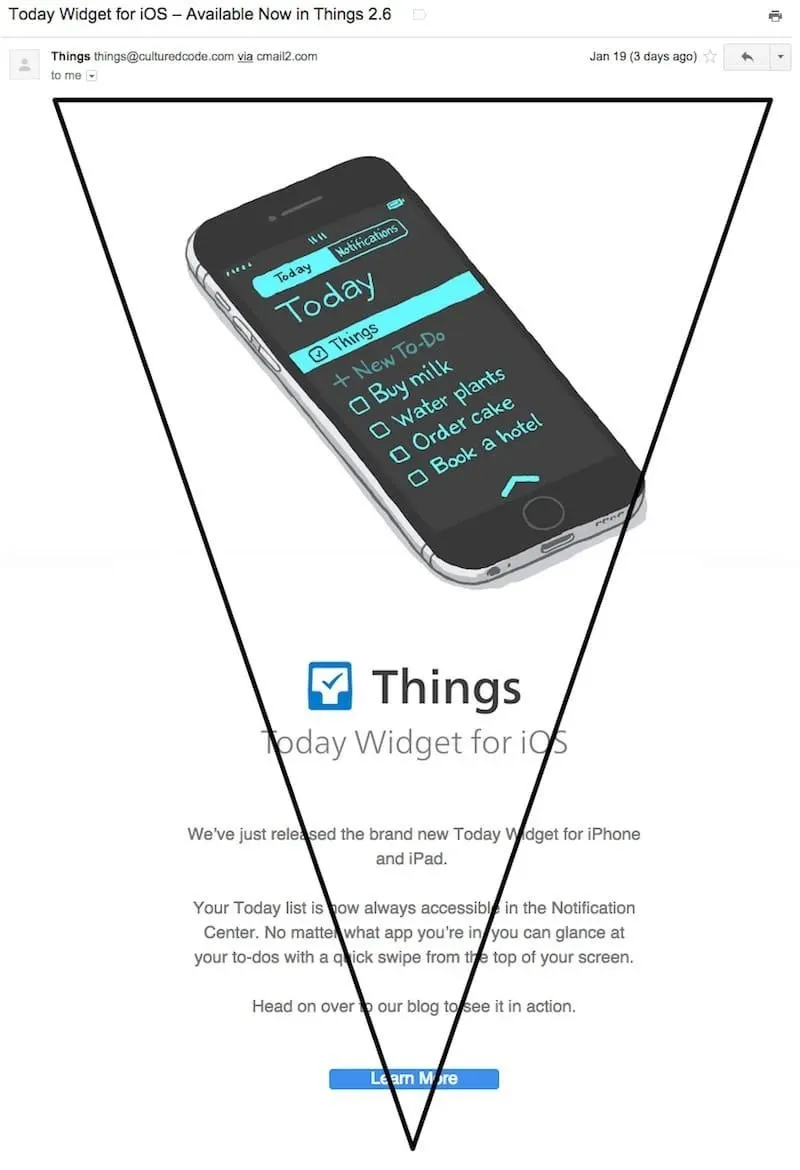
Image from Getvero Triangle layout
Mosaic layout: This layout uses different-sized boxes to showcase multiple products or messages visually appealingly. This layout can make the email feel less cluttered and help draw the reader's eye to specific messages or products.
Single-column layout: This simple layout uses one large column for all content, with a clear hierarchy for information and call-to-action buttons. This design is easy to navigate and mobile-friendly.
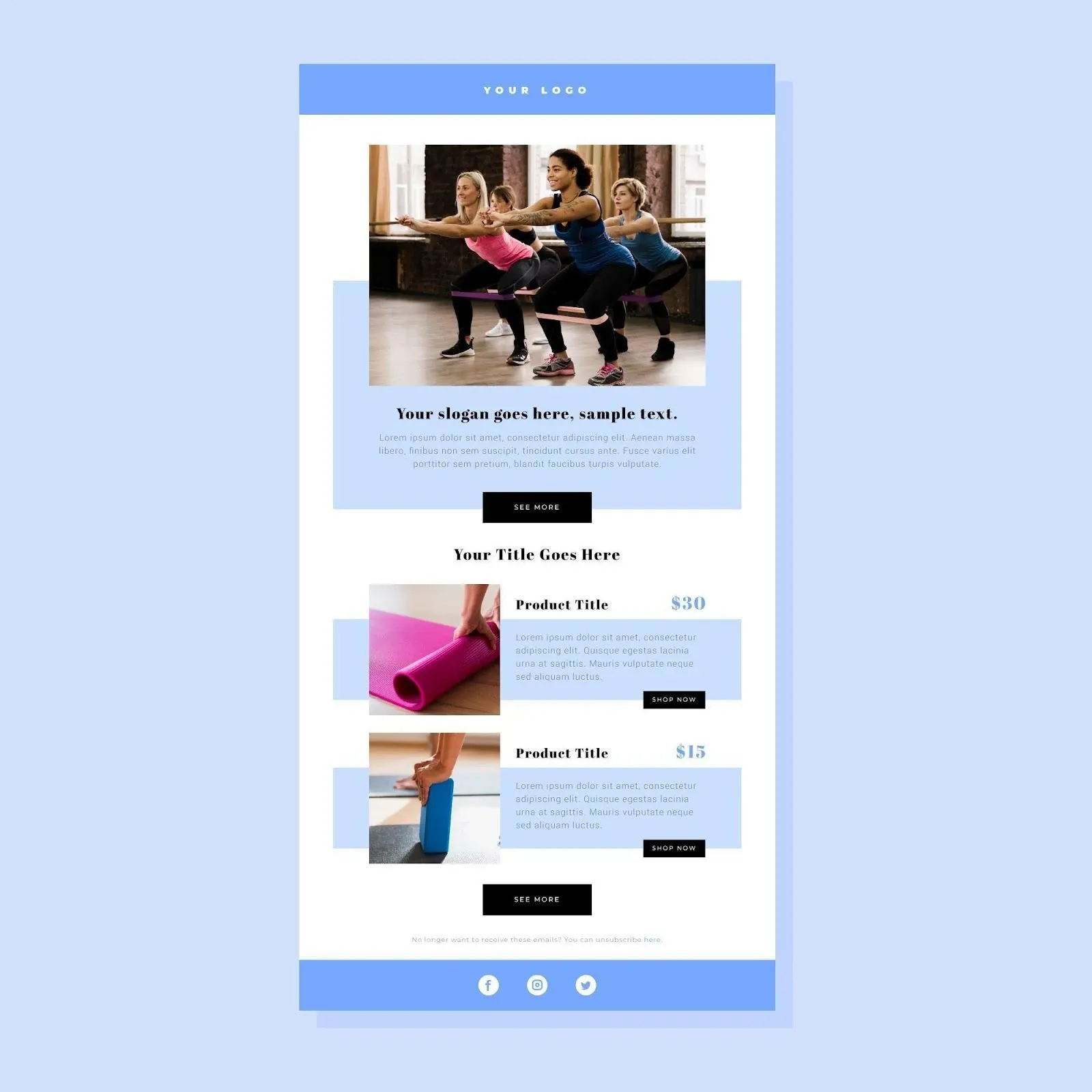
Image from Freepik Single-column layout email
Some predicted email layout trends for 2024 include incorporating more interactive elements, such as carousels and embedded videos, and using dynamic personalization features to customize the layout for each recipient. Additionally, minimalist designs with plenty of white space will continue to be popular.
Overall, it's important to test different email layouts to see what works best for your audience and brand. Keeping up with current design trends can also help capture attention and stand out in crowded inboxes.
5. Online From Builder
One way to ensure your email designs are up-to-date is to use an online form builder. Form builders allow you to quickly and easily create custom forms that are designed to meet the latest email design standards.
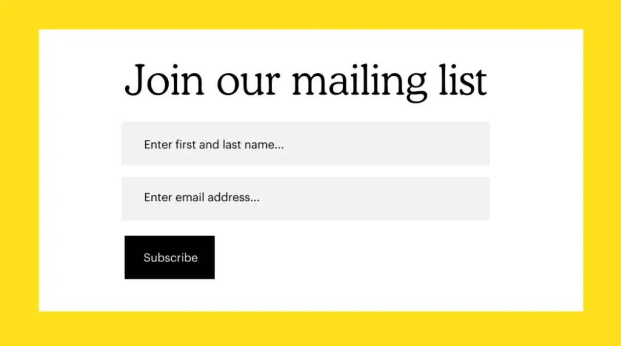
Image from Mailchimp
In addition, form builders can also help you to create responsive email designs that look great on all devices. With so many email design trends to keep track of, using an online form builder is the best way to stay ahead of the curve.
6. Mobile and Desktop Versions
Keep your email recipients in mind when you design them. Many people read emails from their smartphones or other mobile devices, and with the technology available today, people can even check their email on their watches.
It's important to design your emails with both mobile and desktop versions in mind so that they are easily readable and visually appealing no matter what device they are being viewed on.
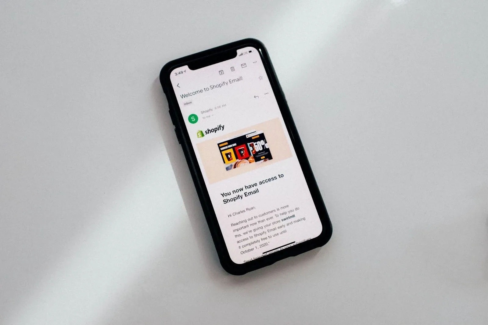
Image from Unsplash Mobile Email design
Some tips for designing with mobile devices in mind include using a single-column layout, larger font sizes, and clear call-to-action buttons. Additionally, consider the limitations of mobile devices, such as smaller screen sizes and slower loading times, and optimize your design accordingly.
In the future, it's likely that mobile email usage will continue to increase and become even more important for email design. Stay ahead of the curve by keeping mobile devices in mind now.
7. Call To Action
In email design, a Call to Action (CTA) refers to a button or link that prompts the reader to take a specific action, such as clicking through to a landing page or making a purchase.
When incorporating CTAs into your email design, it's important to make them clear and visually appealing. Use contrasting colors and bold text to make the CTA stand out, and include clear and compelling language to encourage readers to take action.
In terms of trends for CTAs in 2024, personalization will continue to be important. Tailoring CTAs to specific segments or individuals can increase click-through rates. In addition, using emotive language and creating a sense of urgency can also be effective in prompting readers to take action.
It's also important to continue testing and optimizing your CTAs, as what works for one audience may not necessarily work for another. Continually analyzing metrics such as click-through rates and conversion rates can help inform future CTA strategies.
You should add your social media links in your email along with your call to action. This allows recipients to connect with your brand on multiple platforms and stay updated on any future promotions or events.
The best references to create professional email designs.
Final Thoughts
Email design is constantly evolving, and staying on top of current trends is important to capture your audience's attention and drive action. Some key trends for 2024 include personalized layouts, mobile optimization, and effective CTAs.
Using an online form builder and continually testing and optimizing your designs can also help ensure your emails stand out in crowded inboxes.
Remember also to include links to your social media platforms in your email designs, as this allows for even more opportunities for engagement and connection with your audience.
And utilizing reference software such as Email On Acid or Campaign Monitor can help create professional and on-trend email designs.

