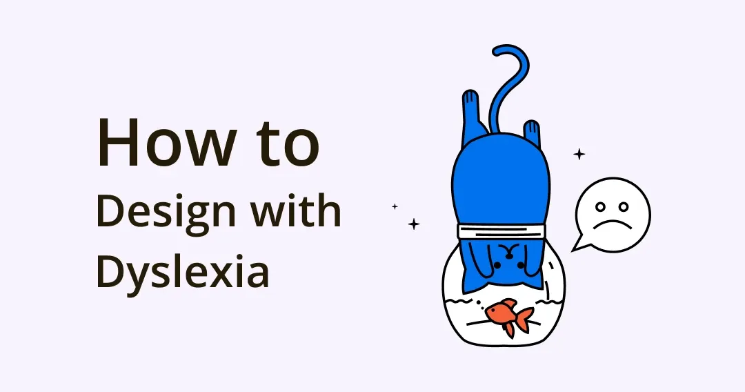
Designing with Dyslexia: Creating More Inclusive Commercial Designs
About 20% of the world population is dyslexic. As the most common neurocognitive disorder, it affects 1 in every 10 people in the world. While official classifications do consider it a disorder, people with dyslexia tend to disagree. They present a more accurate term, neurodiverse, which makes sense. Dyslexic brains are not incorrectly wired – no disorder there. They are just differently wired. And our current education system is not designed to cater to the unique and diverse ways dyslexic minds learn new things.
For example, people with dyslexia usually struggle with language, speech, and comprehending complex verbal instructions. But on the other hand, they excel at lateral thinking, spatial reasoning, vivid imagination, critical thinking, empathy, and emotional intelligence, among other skills.
However, since they do perceive the world quite differently, and represent millions of people around the world, it’s important to keep their dyslexic limitations in mind when creating any kind of commercial design: websites, apps, logo designs, product labels, and such.
What is Dyslexia?
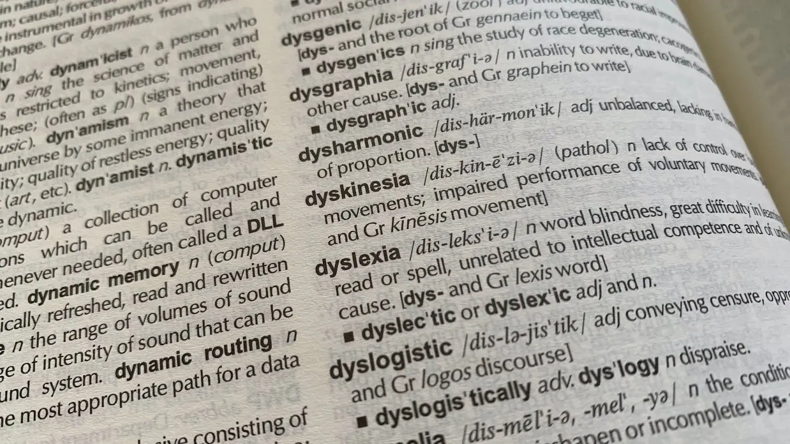
Image from Unsplash / Rob Hobson
Dyslexia is characterized as a difference in learning and reading disability in which people have trouble identifying basic sounds of speech. They cannot connect letters with sounds that those letters make, such as the ‘c’ sound in the word ‘cat’, which makes it difficult for them to pronounce words of varying lengths.
It’s important to note that this learning difference does not hamper their intelligence. A dyslexic person can be of above-average intelligence, average intelligence, or below-average intelligence.
Throughout modern history, we’ve had gifted thinkers, brilliant innovators, and exceptional artists who have had to deal with and overcome dyslexia.
Leonardo Davinci, Walt Disney, Albert Einstein, and Richard Branson are often quoted as some of the most famous dyslexic people in the world. America’s sweetheart, actress Jennifer Aniston, accomplished writer Agatha Christie, and world-famous chef Jamie Oliver are also dyslexic.
How Dyslexia Makes Design More Innovative
The difference in brain wiring that affects language and speech in dyslexic people is the very thing that makes room for more innovative thinking. I mean, if you are launching a new brand, hire a dyslexic graphic designer to create your logo. They are likely to produce a more inclusive and intentioned design than a regular artist.
What makes this likely is that dyslexic people don’t go linear – from point A to B to C. No, their thinking is very top-down. They are more exploratory thinkers and consider a problem in its entirety.
Here are 5 less common abilities of dyslexic geniuses that make for brilliant design innovators.
· Visual Thinking
Image from Unsplash / Sebastian Herrmann
We all are visual thinkers to some extent. We think in images thousands of times a day – logos, icons, emojis, and videos, basically all of the media.
But for dyslexic brains, their entire thinking is in visuals. Pictures, images, and graphics. This allows their thinking to become more focused and organized in terms of priority, and incredibly simple to communicate to others.
· Lateral Thinking

Image from Pexels / Miguel Á. Padriñán
Most of us grow up with a linear thinking approach. When presented with a problem, we move in sequences – 1, 2, 3, and so on. With lateral thinking, we go side-ways. Disregarding the most obvious solution, we expand the lens and see what else can be done about it.
Regular folks have to unlearn a lot when trying to master lateral thinking. But dyslexic brains are naturally gifted with this enviable cognitive tool.
· Three-Dimensional Thinking
People who can think in three dimensions are able to turn over and manipulate objects and information in their minds.
James Russell, the guy who invented the compact disc, was famously able to design the entire thing in his mind, long before he touched a single tool. He was able to visualize and process the invention and how he would go about the process, in vivid detail, all in his head.
What to Consider When Creating Neurodiverse Design?
Neurodiversity refers to many different ways of thinking, learning, and behaving – with no one method being superior or inferior to any other, thus nothing is considered a disorder or a deficit. With this inclusivity in mind, graphic designers need to learn skills to manipulate design elements to make them appealing and comprehensible to anyone who views them or interacts with them.
· Color and Contrast

Image from Unsplash / Daniele Levis Pelusi
Color is a highly dominant component of visual design. It’s usually the first thing we notice when we look at an image. Contrast specifies the difference in brightness between background and foreground color.
Neurodiverse design needs to take both color and contrast along its decision-making journey. Saturated colors such as blue, brown, and green are preferred by the neurodiverse audience while brighter shades are shunned.
With contrast, again you have to be extra careful. Those who are on the extremes of the neurodiversity spectrum may react strongly to bad contrast. Avoid the classic black and white situation. Nothing too glary or too bright. Go with muted shades, pastels, and tones with deep saturation. The color with the most sensory distraction and overload across the entire spectrum is yellow. Cooler, milder tones are more sensible when you have inclusive design as your goal.
It’s also important to note that dyslexic people are good at detecting contrast between text and background color. If you are unsure whether your contrast levels are optimum, WCAG is a great place to start.
As a rule of thumb, if your visual design is there to communicate something, don’t let color carry the burden alone. Use text or other elements to help carry your message forward.
· Typography
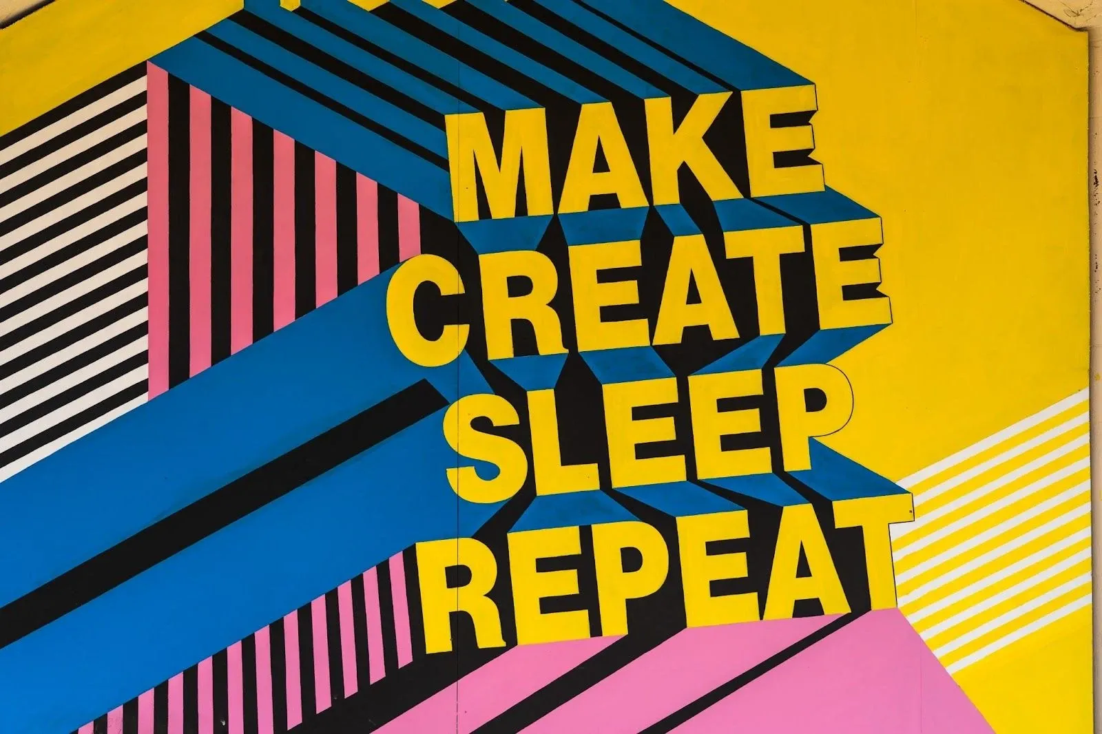
Image from Unsplash / Nick Fewings
While typography affects the readability of the design anyway, for neurodiverse users it becomes even more crucial. You have to keep three areas in mind.
Your font choice. Some fonts are just better designed than others. Sans serif fonts, for example, make for easier legibility and comprehension than Serif fonts. On digital mediums, especially, serif fonts with all their bells and whistles can become extremely difficult for dyslexic people to read. Therefore, if Serif fonts are a necessity, keep them confined to headings only, and ensure there’s enough spacing between letters so there’s no reading challenge.
Talking about spacing, that’s another area you need to focus on. Regardless of the font type or style you are using, sufficient kerning is important. Don’t crowd the words. The British Dyslexia Association recommends keeping the letter width at 35% of the average letter, and the inter-word spacing at least 3.5x the inter-letter spacing.
Lastly, the size of your fonts. It matters to all of your users. Keep the letters at a size that makes it easy to read the text without squinting or keeping the device at an arm’s length. According to BDA, 12-14 points is the ideal size. For headings, aim for a 20% larger size than the body text.
· Language

Image from Unsplash / Ian Dziuk
To make design more considerate for all of your audiences, your language has to improve. This is the area where dyslexic users face the most difficulty. So this is the place where you can make the most impact.
Here are a few tips.
- Simply the vocabulary
Writers often worry that plain and simple language will diminish their authority. Especially if they represent a technical field. But that’s a myth. Keeping your intended audience in mind, a simpler and more concise language is always preferred than text littered with jargon. It’s not only inconsiderate but can even come off as an attempt to compensate for the lack of command on the subject.
In simpler words, choose simpler and plain words for an easier and more interesting read.
- Shorten your sentences and paragraphs
This applies to all readers. Shorter sentences and paragraphs help avoid getting distracted and make for more imposing text. Diving your content into multiple paragraphs also gives a break and breather to users.
- No metaphors or abbreviations
It can be challenging for dyslexic users to keep track of the many abbreviations you are using throughout your text. Either keep them to a minimum or avoid them altogether if you can. The same goes for metaphors. Dyslexic users find it hard to make the connection between vague expressions and actual meaning. So instead of saying ‘a breath of fresh air’, say ‘a welcome change’.
- Use active voice always
Passive voice language is usually harder to understand compared to direct, crisp active voice. Instead of using vague, lengthy words, go for a more confident, active voice syntax.
- Break up your instructions into smaller steps
Even if the process you are describing is simple, when you break it up into smaller procedures, your dyslexic audience is going to thank you for it. For general readers too it becomes easy to skim through, which is how the majority of the internet consumes content on the internet anyway.
- Bulleted lists, everyone!
Organize your information in an easy-to-follow structure such as bullets and numbers. It not only helps organize your thoughts in a hierarchical structure, but will also break the monotony of a long body of text.
· Hierarchy

Image from Unsplash / Edvard Alexander Rølvaag
Hierarchy makes it easy to follow the information on the graphic much easier. Contrasts in size, placement of elements, spacing, and other features can make it easy for viewers to understand how the information is flowing – which part comes first, then second, and so on.
Dyslexic users benefit from hierarchy the most as theirs is primarily a reading/language limitation. Without relying on language alone, hierarchy in icons, buttons, and other imagery can also clue the viewer in on where to move next.
Headings, pointers, text alignment, and spacing are some of the tools you can use at your leisure to make the graphic navigation as smooth and intuitive as possible. White space will work as your best friend, helping segment and segregate the layout.
Important note: when structuring the layout, avoid ‘Justified’ formatting. It’s a nightmare for all users, especially dyslexic and neurodiverse.
· Simpler Visual Cues

Image from Unsplash / Jalen Banks
When designing for dyslexic users, it is important to remember their preference for visual information. As graphic designers, we are aware of how even little design decisions can affect the whole impact of the image. A slightly brighter color, a tweaked icon, inappropriately placed image, is what epic design fails are made of.
To ensure yours doesn’t meet the same fate and can actually help your viewers, add lots of visual-based info in your graphic. If you are designing a logo design, sure it’s going to be mostly icons and imagery and you don’t have to worry about too much text. But what about an infographic or a poster or a book cover, or a web page?
You have to stop and strategize how you can supplement the text with enough visual cues that your dyslexic customers won’t be turned off. You need to be careful here because you don’t want too many visual cues. An icon-rich visual can as easily is a sensory overload as a long piece of text.
· Consistency

Image from Forbes
Of all the topics we have discussed so far, I consider this one to be the most critical. For the simple fact that if you are unable to follow all of these instructions consistently, then there is no point to any of it. The only way any of this can be effective is when you make it a part of your entire practice.
Inconsistencies in design force dyslexic and other neurodiverse users to frequently break their attention and reacclimatize themselves with the graphic. If it happens often, they may choose to not interact with your product/brand/service altogether.
With consistency, you incorporate trust in your work. Users know what’s coming next. How the heading is going to look like, roughly how long the next paragraph will be, and what a certain icon means in a particular context. It not only makes for a considerate design, but a more trustworthy design, too.
Conclusion
With more than 700 million dyslexic people around the world, it will be a mistake trying to disregard them when creating any design work. Neurodiverse design is not just inclusive design, it is good design. It’s the only approach to design that makes sense for everyone, every business. I mean, as a brand, would you really want to sideline a portion of 700 million users? And these are the ones that we know about. Estimates suggest that 50% of neurodiverse people are not even aware that they are not on the spectrum.
So, unless you are making every product, website, label, page, logo, and ad neurodiversity-friendly, you might as well not bother with any of it.
Related Posts